
Creating a colour palette for my company or even my personal website was one of the tasks that took me more time than I would have expected, probably more than I care to admit 😊. That said, our mind is hardwired to associate feelings and signals with different colours. Therefore, it’s safe to say that choosing colour for your project might be one of the most important items to check of you list.
Having done it a couple of time now I have a few of options that worked for me:
- Choose by meaning and psychology of colour
- Colour mood board matching your brands characteristics
But first things first, before diving into the world of colour wheels and pantone palettes, start with defining your buyer’s persona. Knowing your target customer will ensure your brand identity (and with that the colours you choose) evoke trust and sympathy for your product. You want to create a visual identity that is universally recognisable and that intelligibly connects your audience with your brand.
4 simple steps to follow when using colour
Before getting started there are a few general rules when it comes to picking out your favourite colours.
- Its best to stick to three or four colours
- Split colour by the 60 – 30 – 10 rule
- Accent colours should only be used sparsely to draw attention
- Use the colours consistently in your design
Although there are endless choices of colour, it generally advised to stick to 3 to 4 colours. For one it will make choosing your colours a hell lot easier but most importantly they won’t end up fighting for attention. Want to lear more? Read this.
Its best to pick one dominant, one secondary and one accent colour in the ratios 60%, 30% and 10%, respectively. If you stick to this rule in print and web you can direct your audience’s attention specifically to where you want it, such as call to action buttons or your products unique selling points. Eyes are always drawn to what is different! If you would like to introduce more than 3 colours split the secondary or the dominant colour (in that order) but never the accent. And one final tip, once you have selected your individual colour palette – stick to it! You want to create a consistent branding and design throughout print and web. This will ensure any of your material is pleasing to look at and universally recognisable.
Ways to pick the perfect colour palette
Option 1: Choose by meaning and psychology of colour
Colour is what surrounds everyone, everywhere, and our mind automatically associates colours with signals, moods, or feelings. So, when choosing your colours, especially your dominant colour, always pay attention to what most people feel when they see this colour. That said when picking further colours to match your dominant one, ensure they fit and are pleasing to the eye in combination.
Therefore, it’s fair to say that choosing colour is an art and a science.
At this point I will assume that you have created your buyer’s persona and you are aware what feelings your brand needs to communicate to succeed with its audience. With this knowledge on hand look at one of the many colour wheels available online that will nicely explain which colour has which meaning. One page I used a lot was from graf1x which gives a nice but comprehensive summary of all colours and what they mean. If you would like to learn more about each individual colour visit Canvas page.
Once you have selected a dominant colour that fits your brand, its time to find some matching secondary and accent colours. Again, there are multiple tools that will help you with this, from preprepared colour combinations from designers to automated tools that will find matching colours for your choice. If you don’t trust yourself to pick colour combinations that work, try canvas colour palettes, they have a huge selection of predefined colour combination and I am sure you will find something that fits in there. If you do want to take it into your own hands make sure not to choose by random but rather experiment with complementary, analogous or split complementary combinations. A tool that worked for me in finding those was an application from colorsupplyyy.
Option 2: Colour mood board matching your brands characteristics.
A different way and my personal favourite is to use characteristics that match your brand and create a image mood board. Like the method described above this assumes that different characteristics are associated with different colours. Therefore, choosing words that match your brand will help to find colours that highlight the characteristics that you want to have associated with your brand. In a nutshell this is what you need to do:
- Pick 3 to 5 characteristics that match your brands profile
- Enter them into a picture search
- Select 2 to 4 images that you find visually pleasing for each word
- From those images select the 4 to 8 images that you like the most
- Extract the colours with a colour picking tool
- Arrange into groups of complementary, analogous, or split complementary combinations
- Pick your favourite colour palette!
Start by picking words that you think match your brand, project or personal profile. If you need something to start with have a look at the list below and pick no more than 3 – 5 words. The example I choose was for my personal blog for which I choose the words: strong, fresh, experienced, friendly. Next enter each word on its own into a search engine of your choice, look at the image search and select 2 to 4 images that you find visually pleasing or that contain colours that you like. Once that’s finished for all characteristics you should end up with a mood board that looks a bit like mine below.
If you have started of with less words or images than I did you might be able to move to the next step immediately. If you have been as undecided as I was, add an extra step where you select only the 4 to 8 images that you like the most.
Otherwise, you will end up with a huge range of colours that look more like a colour wheel than a palette. Now its time to extract the colours from those images. There are multiple ways to do this and it really depends on your availability of a graphic design program. You can either use online tools such as photocopa or use the colour picking tool of a graphic design program such as Adobe Illustrator. If you have been really focussed with your image search and colour picking you might have completed your goal here and already have the perfect colour palette in front of you. More likely though you will have several colours in front of you that you can choose from. Now there are two ways to go from here. Either, you have an idea for a dominant colour group already, let’s say blue for trust. Then pick a blue that you like from your colours and add 2 to 3 complementary, analogous or split complementary combinations. If you don’t, then I would suggest grouping the colours into combination that are pleasing to the eye and follow the direction about complimentary contrasts above.
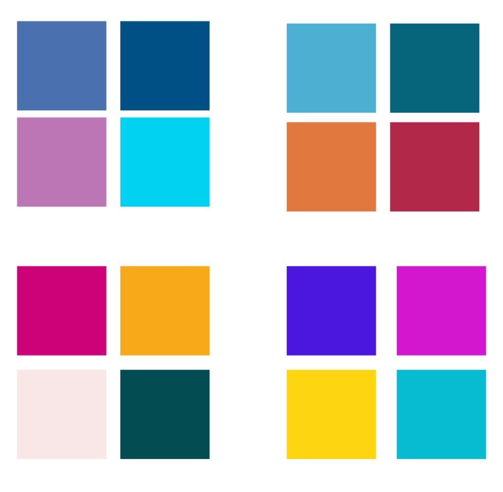
Once that’s done you will end up with a couple of choices of which you can pick the one that you like the most. For me that was, a dark green as the dominant colour, a light rose as a secondary and both pink and yellow as accent colour.

Here you have it, two different ways to find the colour palette that fits your brand or personal website. I hope that article was useful to you or if anything gave you some inspiration on where to start.
Good luck!